Ready for more?


Why Beautiful Websites Fail to Convert and What's Actually Missing With Em From Sparo Studios
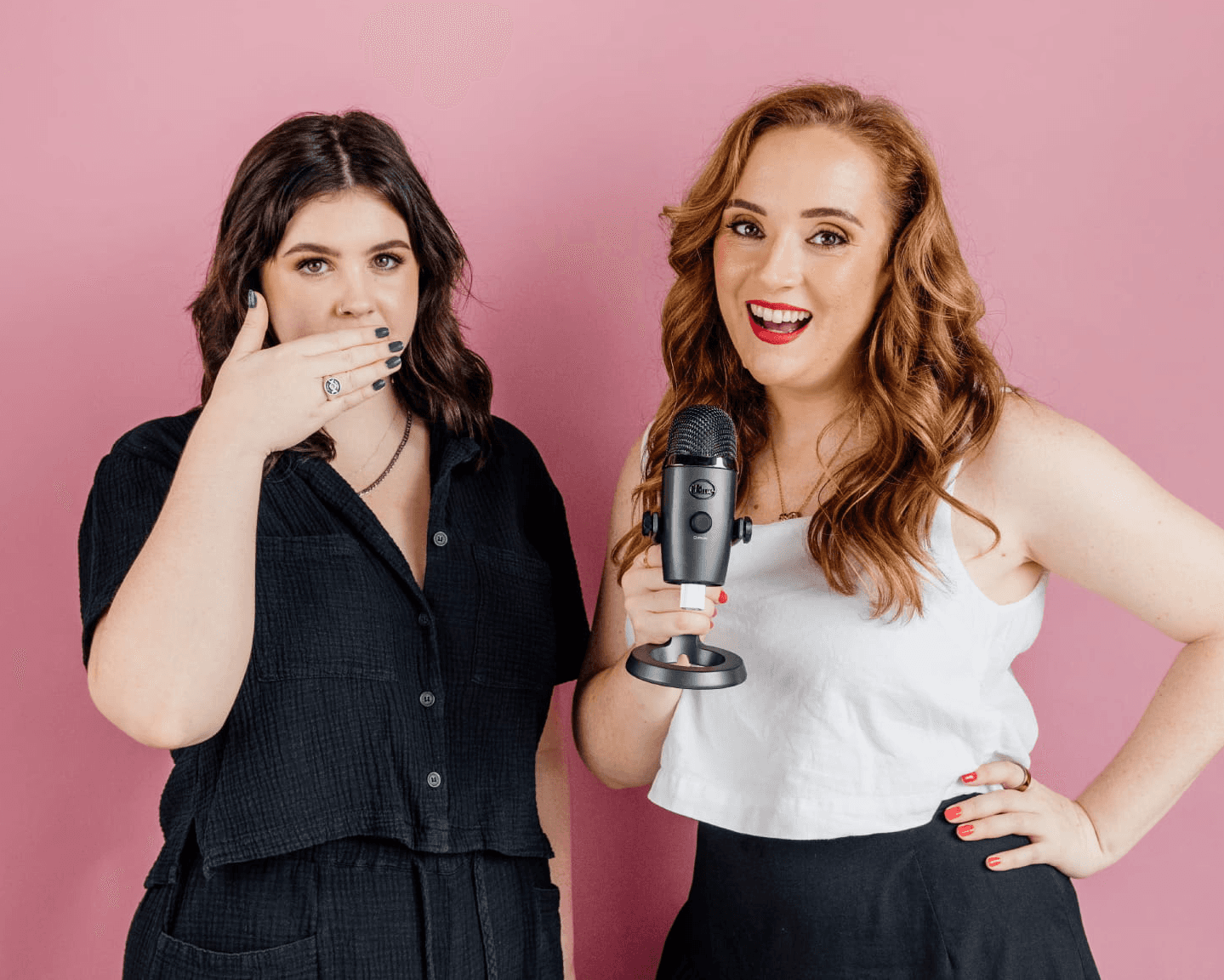
Emma from Sparo Studios joins me to talk about the two things she reckons every eCommerce website is missing, brand and UX. Not just what they are, but why having one without the other is quietly costing you conversions. Emma breaks down the difference between having a logo and actually having a brand, how to figure out your positioning in a crowded market, and the specific things she looks at when auditing a website, from landing pages to the often-underestimated About page.
There’s also a really practical conversation about how all of this connects directly to your ads. If your website and your Meta ads aren’t telling the same story, you’re burning budget no matter how good your creative is. Emma shares case studies, quick wins you can action today, and why she thinks the brands that nail their foundation now are the ones who’ll be thriving as the eCommerce space gets even more competitive.
In today’s episode, you’ll learn:
Why having a logo is just the starting point, and what an actual brand really means
How to figure out your positioning in a crowded eCommerce market (and the two-sided scale Emma uses to find it)
Why brand and UX are the two pillars every eCommerce website needs to perform
What Emma looks for first when she audits a client’s website
The real difference a landing page makes when you’re sending paid traffic, and why your homepage probably isn’t it
Why your About page is working harder than you think (and what to put on it)
How to identify whether you’ve got a brand problem, a UX problem, or a conversion problem
Why the disconnect between your ads and your website could be quietly killing your results
Emma’s one piece of advice for anyone who doesn’t know where to start
Chapters and good places to start:
00:00 Introduction to Sparo Studios and UX Design
02:52 Why Brand Matters More Than Ever in eCommerce
05:57 What UX Actually Is and Why It’s the Science Behind Design
08:55 Case Studies: Real Results from Brand and UX Work
11:54 Quick Wins for Improving Conversion Rates
14:57 Landing Pages and Where to Send Your Ad Traffic
17:55 The About Page and Why It Builds Trust
20:41 How to Identify Where Your Conversion Issues Are Coming From
23:34 Final Advice and How to Find Emma
Transcript
Emma – Sparo Studios (00:00)
What is stopping people from buying this product? What are those objections that are coming up? And how do I answer them? Because someone is scrolling down that product page — if they’re getting low enough, they’re looking and hunting for information that they haven’t found yet.
Dahna Borg (00:12)
Hi and welcome to the Bright Minds of eCommerce podcast. I’m Dahna, founder of Bright Red Marketing, and I created this podcast because I wanted to bring you the best advice from Australian experts in eCommerce and eCommerce store owners. If you’re wanting relatable stories and actionable advice, as well as the latest Facebook advertising strategies, you’re in the right place. So let’s get into today’s episode.
Dahna Borg (00:31)
Hi and welcome to the Bright Minds of eCommerce podcast. Today we’re here with Emma from Sparo Studios. Welcome, Emma — it’s so good to have you. Before we jump in, can you please give everyone a quick intro into who you are and what you do?
Emma – Sparo Studios (00:37)
Hello, hello, thanks for having me! So I’m Emma. I run an agency — a design, development, strategy, and marketing agency called Sparo Studios. We’re a team of all of the above: designers, developers, marketers, but also what we do differently is we have a whole team of strategists as well. We really focus on UX and brand strategy working together to build the kind of results that we do for brands and websites, and that feeds into the rest of their marketing channels.
Dahna Borg (01:09)
Wonderful. So most of what we want to talk about today is around that user experience design of the website. For those who are unfamiliar, can you explain what user experience — sometimes referred to as UX — is?
Emma – Sparo Studios (01:21)
Yeah, definitely. It’s the psychology behind design — how it looks, how it’s used, and the experience someone has when they view your design. It’s really the science behind it. There’s a set of rules to follow: how people feel comfortable in a design, how it works and feels for the user. That’s where we really focus. You can also get so deep into it with big UX agencies where they get into research groups and — especially with the changing behaviours of how people are buying — it can get super deep and nerdy. But at its core, it’s really the science behind design, which is super exciting.
Dahna Borg (01:58)
This is where people start split testing different header images and the way things are laid out — very simplistically said, obviously.
Emma – Sparo Studios (02:06)
Yeah, that would be more on the level that we operate at. Where it gets super complex is when you bring in research groups and university studies and things like that.
Dahna Borg (02:17)
Yeah, I love it. I think my favourite story around UX is that guy who used to do drunk audits. He’d get drunk and then use your website and tell you whether it was usable or not. And then he roped in his grandmother to get the elder demographic’s perspective.
Emma – Sparo Studios (02:31)
I can’t lie — I might’ve had a glass of wine or two while reviewing websites, so maybe I should make a video about it.
Dahna Borg (02:35)
You’ve got to do what the consumer is doing. There are plenty of people having a glass of wine and going online shopping, so it works.
Emma – Sparo Studios (02:46)
That’s a good content idea — I’m going to write that down.
Dahna Borg (02:48)
You’re so welcome. Now, one of the reasons I’m so excited to chat with you is because not only do you focus on the technical aspect and conversion rate, but you really focus on the brand aspect — which I think is so important in the cluttered space of eCommerce right now. Why, in your opinion, is brand so important in that space?
Emma – Sparo Studios (03:11)
Yeah, we’ve made this shift in the past couple of years, just seeing how people buy from brands and how much UX and design plays a role in combination with brand. We’ve seen a lot of eCommerce brands moving in this direction in terms of how they perceive themselves online. We were having a lot of people come through the doors — especially in the eCommerce space — where their website from a UX perspective wasn’t anything crazy. It was working, it was following the rules, it looked like it should be doing the job — but it was missing that brand component. So it’s something we’ve reworked over the past few years: what does that process look like? What are the two pillars we believe every website needs? And those are brand and UX. There are a few other pieces, but those are the core ones we focus on in strategy to make sure the brand and website actually perform the way they should.
Dahna Borg (04:07)
Yeah, I think it’s so important. A lot of people start eCommerce businesses with a dream, get a Shopify template, and think they’re done. I mean, technically those templates are designed well to an extent.
Emma – Sparo Studios (04:17)
Absolutely.
Dahna Borg (04:19)
Shopify is a massive company. People get a logo done, they think they’ve got a brand, and they’ve got a nice Shopify template. What is the next level of brand beyond a logo? Because they are vastly different things, and I think a lot of people miss that connection — “I have a logo” doesn’t necessarily mean “I have a brand.”
Emma – Sparo Studios (04:38)
Definitely. So when we talk about brand — and this is the funny thing with UX — we’re very much talking about design and how things look and feel. But when we talk about brand, yes, we’re talking about your visual brand, but more importantly, we’re talking about your actual positioning in the market and what you do to stand out. That’s what we really focus on.
Most eCommerce brands or business owners who’ve been around for at least a year have already had a push to understand their business, their ideal clients, what they stand for. So we don’t focus on that as much because most people already know it. When they come to us, they understand that brand includes visuals, and they understand who they’re speaking to — but they don’t actually know how to position themselves or bridge the gap around what their brand communicates, what it says, and what makes them stand out and be different. It’s that positioning piece that we really focus on, and combined with the UX, we’re able to get the kind of results we do for our clients.
Dahna Borg (05:33)
Yeah, I think that’s incredible. Say someone comes to you and you’re reviewing their website and their brand — what are some of the things you’re looking for and why?
Emma – Sparo Studios (05:38)
So if someone walked through the door tomorrow — an eCommerce brand — we would focus first on the brand, because that’s the foundation of the business. We want to make sure it’s doing its job. We look at things like positioning: what are you doing differently? Why should someone come to you? What separates you from everyone else?
When I say this, some people say they don’t really do anything different, or they’ll throw out some big ideas. The thing is, when developing what makes you stand out — your point of difference — there are two sides of the scale. You can go so different and bold that you have to educate the customer on what it is and why they should buy it because it’s something genuinely new. Or you might be on the other end of the scale where it looks very similar to your competitors on the surface, but you have to explain why you’re better and why that point of difference matters.
So the first conversation is always: what makes you, you? What makes your brand stand out?
Most people know the “what” — we might refine it slightly — but then we bridge the gap to the “why.” Step one is the what, step two is the why. We need to connect why that’s important to your customer. A lot of people will stand on their soapbox and say “this is why we’re so good,” but they don’t actually know why it matters to their customer. So we bridge that gap. Then step three is the “how” — how are we actually going to prove it? This is where your visual brand plays a role, where the UX of the website comes in, where proof elements live. We develop that point of difference first, then work on how to communicate it — and we also do competitor research: what are they doing well, what aren’t they doing well, and how do we make sure we’re beating them there too?
Dahna Borg (07:37)
Yeah, I think everyone just needs to go through that process. I’m sitting here wanting you to do my site right now! And I think for people listening who are thinking “I’ve never actually thought about that” — don’t feel bad. These are the kinds of things you really need someone’s help with. You can have your business and go through all these things, but it is genuinely hard to flesh out and even harder to execute in a way that actually comes across.
Emma – Sparo Studios (08:13)
Yeah. And it’s changed so much in the past couple of years. I’ve sat in the room next to — and I’m sure he won’t mind me sharing — a $10 million fitnesswear brand founder. He’d sold his company, but he was competing with brands like Stax. And he literally said, “eCommerce brands are like frogs in a boiling pot — they don’t realise how important brand is until it’s too late.” And in a really competitive space, even people who’ve built and sold big companies are starting to realise it. Either you’re already feeling the pressure and seeing these brands with incredible positioning pop up, or you’re going to feel it in the next couple of years, because that’s just the direction the market is moving.
Dahna Borg (09:07)
Yeah. We have so many conversations with people — clients or potential clients — who say “we want to be like this brand.” Then you look at their website and something’s off. When you look at the brand they admire, you can see exactly why they’re successful: they’ve done such a great job, everything is intentional. But fine just isn’t cutting it anymore.
Emma – Sparo Studios (09:18)
No. And every industry is feeling that — eCommerce, services, wherever you’re at. There is going to be a shift where it requires a lot more creativity and a lot more thought around how we communicate. And we’re going to see that accelerate as things get more competitive and AI evolves.
Dahna Borg (09:48)
On this note, are you comfortable sharing a case study or two — obviously keeping clients private where needed — around what you changed and what the results were?
Emma – Sparo Studios (10:03)
Yes! So we did this with a client — her brand is Dreamer RV. We’ve worked with her exclusively over the past two to three years, making subtle evolutions to the brand along the way. At first we focused very much on UX, which was what the business needed at that stage. She’s got products in the caravanning space, which is an incredible space to be in — but it’s getting more and more competitive.
She initially came to us for UX improvements. But then she started to notice the space getting more competitive, which is when she really came back to us for the positioning and brand work, along with the UX refinements that followed.
She started in the low five-figure months — just startup vibes, getting things going. From there, she had her first seven-figure year, which was really incredible, driven largely by the UX work we’d done. Since then, with the space becoming more competitive, we’ve done a lot of positioning and brand work with her over the past year, and she’s had her biggest year yet — including an absolutely insane Black Friday. I probably shouldn’t share her exact numbers because they were extraordinary, but it was a really incredible year.
A lot of that comes down to the positioning work, the website evolution, and — the thing with eCommerce is it really is a combination. We got the UX right. Her space got more competitive, so we did the brand work. And then it’s ads and driving traffic, which she’s also invested in heavily. With eCommerce, you’re building that foundation — your website — and it’s those three pillars that drive growth. Our job is to set up the base; from there you put the fuel in, and she’s done a really great job of that.
Dahna Borg (11:52)
I think this is something even people in the ads world don’t always appreciate — the difference the landing page you’re sending people to can make. We’ve got software now that lets us see the purchase conversion rate from individual landing pages, and the difference is wild.
Emma – Sparo Studios (12:10)
Absolutely.
Dahna Borg (12:18)
What are some of the things you find make a difference on those pages when you’re sending cold traffic? We’ve found sending people to homepages is not ideal, but in your experience, what do those landing pages need?
Emma – Sparo Studios (12:32)
Yeah, this is actually one of the first things we ask about in the strategy stage — and a lot of agencies or brand strategists skip it because it feels like it’s in the too-hard basket. But you really need to know where your traffic is coming from when designing particular pages.
A homepage can be designed for slightly colder traffic — I wouldn’t recommend it across the board. If you’re running ads, I’d never send traffic to a homepage unless it’s a brand awareness campaign. But if an ads agency is using a homepage, we’ll optimise it further to be ready for that colder traffic. Otherwise, we’re designing dedicated product pages or landing pages.
If someone is already running ad campaigns, we’re looking at heat maps to see what’s working. For cold traffic, you want trust elements as high as possible on the page, and you want to highlight your points of difference quickly and clearly — then expand on them further down. You might also add FAQs specifically handling objections, because you know colder traffic is landing there.
For heat maps, Hotjar is the go-to — Microsoft Clarity is also available, but Hotjar is the one we recommend. It lets you see how people are engaging, how far they’re scrolling, and crucially, which selling points people are hovering on. We had a client running Google Ads to a landing page we’d built, and when we looked at the heat maps, people were hovering heavily on “handpicked surgeons.” So we built an entire section around that — because we knew people were hunting for that information and not finding it easily enough.
Dahna Borg (14:40)
I love that so much. And I love that people listening can just go and install Hotjar right now and start making changes themselves. eCommerce is hard — no one’s denying that — but some of this stuff people just don’t think about. Or they have Hotjar installed but don’t know what they’re looking for. So that’s a really valuable tip.
I suppose this is the million-dollar question: if you had to pick one or two favourite quick wins for improving UX and brand experience, what would they be?
Emma – Sparo Studios (15:30)
My favourites are going to be more brand-focused than UX-focused, because most UX quick wins are more impactful for larger companies. If you’re A/B testing button styles at a company doing millions of dollars in revenue, that will move the needle. For small to medium businesses, the bigger wins tend to be on the brand side.
So the first one: making sure all the information on a page is answered — especially if you’re sending someone there from ads. If you open a heat map and people are scrolling all the way to the bottom, that often means they haven’t found what they need. My favourite thing to implement is a well-considered FAQ section — but not just “what sizes do you have?” type questions. Sit down and ask yourself: what is stopping people from buying this product? What objections are coming up? How do I answer them? Because someone who has scrolled all the way to the bottom of your product page is looking and hunting for information they haven’t found yet. Those FAQs should be directly addressing the objections that are stopping them from buying. That’s a huge one.
Obviously checkout needs to be efficient and simple, and for payment gateways — the more options, the better.
The second big one is thinking about how we’re communicating the brand. Founder stories are working incredibly well right now. It doesn’t have to be a full social media overhaul — it might just be adding a founder intro on your homepage or investing in a really well-written About page. There are copywriters who talk about how going from the About page straight to a product page is one of the highest-converting journeys on a website, because people are invested and then they go and buy. Getting people emotionally bought in is huge.
And on the visuals side — don’t underestimate photos and videos. Quality matters, but beyond quality, it’s about storytelling. Video is probably the number one thing we recommend to clients right now. After a strategy session, we actually plan out a creative direction and provide a shot list. It’s not just about having a photographed product anymore — it’s about how you’re telling the story. A founder video, a clip of the product being used in the hero section. The visuals carry so much.
Dahna Borg (18:57)
What are your thoughts on using product images as almost marketing real estate? I’m seeing a lot of brands now putting infographics in their product images — here’s the product with its features highlighted, here’s how to use it. What’s your take?
Emma – Sparo Studios (19:15)
I think those are super valuable — especially on mobile, where images are the easiest and most natural way to take in information. We had a client come to us recently saying she was getting a lot of questions about a particular feature. We walked her through a few ways to address it: in the product photos, on the homepage, in the FAQs. It’s all about layering in more and more answers to customer questions.
When I talk about storytelling through visuals, I mean things like: when someone lands on your homepage, they can see the product in use right away. Or on a product page, they scroll past the images and there’s a short video of someone using it — they can see it and get excited about it.
Dahna Borg (20:09)
Fabulous. Is there any page on a website that you think often gets left behind and could use a bit more love from a conversion perspective?
Emma – Sparo Studios (20:22)
The About page, like I mentioned. There’s a real emotional buy-in factor these days, and people genuinely don’t trust brands easily. That’s why we’re seeing a push for brands to think more carefully about how they’re communicating and how they’re relating to their audience. The About page is the most important page for that — but it shouldn’t just be a place where you talk about how great you are. That’s an element of it, but it’s really about connecting back to why you’re here and why that matters to your customer. The data shows that people who visit the About page and then navigate to products are significantly more likely to buy, because they’re bought in.
Dahna Borg (20:56)
There was a time when people were treating the About page almost like a sales page. Do you think it still needs to be a blend of both, or has it shifted back to being a genuine About page?
Emma – Sparo Studios (21:18)
It’s still a blend — it really depends on the brand and what needs to be said. I have a client in the plastic surgery space, for example, which can feel like an industry that isn’t very values-driven — but they’re genuinely really values-driven. So that’s something you’d absolutely want to highlight on the About page, while still connecting it back to action in a classy, authentic way.
Dahna Borg (21:58)
Yeah, love that. If someone is really struggling with their conversion rate, how do you start to work out whether it’s a traffic problem, a brand problem, a UX problem, or a product-market fit problem? How do you diagnose where to begin?
Emma – Sparo Studios (22:19)
The traffic question is the easiest — how many people are actually landing on your site? You should have that in Shopify or Google Analytics. The next question is: where is that traffic coming from?
But then honestly, most of the time it’s a brand problem. UX is important and your website needs to be functional — but if it is a UX problem, it’s usually something like your payment processor not working, which you can easily test by going through the checkout on your own phone. Send it to a few people, see how it works. That’s something you can actually test and fix fairly quickly.
After that, the next step is brand — how is the product positioned and what does that look like? There’s also a product-market fit conversation, which can sometimes overlap with brand. But that’s where most of my conversations with eCommerce brands end up right now. I’d say UX is maybe 15% of the problem — the majority, at the moment, is brand.
Dahna Borg (23:43)
I was just thinking — we had a client whose conversion rate fell off a cliff at one point, and we eventually worked out that she had installed a checkout app that looked incredibly drop-shippy. Thinking about it now in the context of this conversation, it still came down to a brand problem — not because the checkout app was terrible, but because it was so far off-brand that it caused a trust issue.
Emma – Sparo Studios (24:11)
Yeah, exactly. And this is why, whatever expert you choose to work with, they really need to have a handle on all the different pillars — because right now UX and brand are so integrated, and UX and marketing are blending into the same conversations. When you’re choosing your next provider, get on a call with them and make sure they genuinely understand what you’re doing, because there’s going to be a lot of overlap. They need to understand how the different pieces all work together.
Dahna Borg (24:49)
A hundred per cent. We call it “the disconnect” — when the ads don’t match the website. Even just that mismatch creates a significant drop-off. If you’ve got beautiful creative from a new photo shoot and we build gorgeous ads, but they land on a website that doesn’t feel the same, that’s a big problem. Your ad agency has to be working in line with your website. You can’t hire an amazing ad agency if your website isn’t at the same level. You can have different providers, but they need to be operating at the same standard.
Emma – Sparo Studios (25:41)
I’m ferociously nodding over here — no one can see this, but I really am. We literally had this happen this year: we built a landing page based on the ad setup and data we were given, launched it, and then the ads agency changed the terminology they were using. There was suddenly a disconnect, they came back to us about the conversion rate, and we had to explain that it wasn’t working because the messaging no longer matched what the page was saying. Making sure your ads match your landing page is absolutely crucial — that’s another big quick win if something isn’t converting.
Dahna Borg (26:16)
Yeah, a hundred per cent. We have one of our favourite clients — she recently built her new website herself while still in the early stages — and she made a big batch of design changes overnight. All of a sudden the website went really luxe. But our ads hadn’t changed, so there was a massive disconnect. It just shows how important that consistency is across the board. I love that you work so holistically across all of this.
If someone is listening now and they just don’t know where to start — what’s one thing they can do right now that will make a difference to their site, other than reaching out to you?
Emma – Sparo Studios (27:12)
That is option one! But in all seriousness, the first thing is to identify where the issue actually lies — like we talked about earlier. If it is a brand problem, the most foundational thing you can do is sit down and figure out what your brand is here to do, beyond making money. What are you on the market to do, and how are you doing it differently? Once you know that, you can figure out how your website communicates it — where to add your points of difference, how to frame your selling points. That’s the very first step above everything else. And of course: make sure your website and checkout aren’t broken!
Dahna Borg (27:59)
Such an important one! And from my side: make sure your Pixel is installed. Even if you’re not running ads yet, get it installed. Now, if anyone listening is thinking — much like I am right now — “I need Emma to work on my website,” what’s the best way to get in touch?
Emma – Sparo Studios (28:21)
We’re at sparostudios.com — S-P-A-R-O studios dot com. But come find us on Instagram and hang out — I’m actually really fun.
Dahna Borg (28:25)
I can confirm: she is really fun.
Emma – Sparo Studios (28:27)
It’s @sparostudios. Come hang out, watch our videos — we talk a lot about this stuff. And a tip for everyone: whenever you’re thinking about working with any brand, go and consume their content first. See what they’re doing, how they’re speaking, and make sure it aligns with you. That’s important.
Dahna Borg (28:45)
A hundred per cent. And apparently we’re going to get to watch you drink wine and audit websites soon, so I’m very much here for it!
Emma – Sparo Studios (28:50)
I’m ready. I’m handing that to my content person right now.
Dahna Borg (28:53)
Wonderful! Before we finish up, we have a couple of questions we like to ask everyone. What’s your favourite business book or podcast?
Emma – Sparo Studios (28:59)
I’m a big leadership person because I’ve got a solid team. I’m a Leila Hormozi fan — I love her podcast. It’s really real and honest, with great conversations around leadership. And I think no matter whether you have no team or a big team, learning how to deal with people is just important. It’s good life advice, really.
Dahna Borg (29:18)
That’s just good life advice in general! And your favourite piece of business advice you’ve ever received?
Emma – Sparo Studios (29:24)
You have to be really okay with being uncomfortable in business. You have to be okay with things not feeling great sometimes. We all start with dreams of running a business from a beach with piña coladas. I think you will get there — there are moments you absolutely will — but to run a business well and ethically these days, there are going to be periods of discomfort. And the better you get at sitting with discomfort, and the more you can reframe it as growth, the more business actually starts to feel really good.
Dahna Borg (30:02)
Yeah, I’d agree with that. Well, thank you so much for joining us — it’s been an absolute pleasure having you on the show.
Emma – Sparo Studios (30:07)
Thank you so much, this has been awesome!
Dahna Borg (30:09)
Thank you for listening to the Bright Minds of eCommerce podcast. As always, you can find the show notes on our website at brightredmarketing.com.au — just look for the podcast page. Thanks for listening!